Stake.com app casestudy

Overview

Stake.com is a globally recognized crypto-based online casino and sportsbook, known for its fast, anonymous transactions and wide range of betting options. This self-initiated redesign focused on improving the overall user experience (UX) and user engagement (UI/Interaction) for both new and returning users. The objective was to reimagine the product with a stronger emphasis on usability, clarity, and retention—without losing the brand's bold, high-energy aesthetic.
My goal was to analyze the existing experience, identify usability issues, and propose a design solution that balances simplicity for crypto beginners and depth for high-stakes players.

Challenges

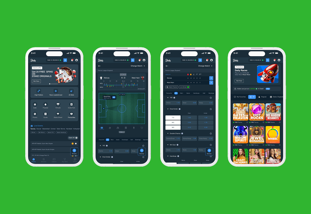
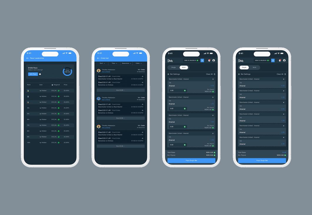
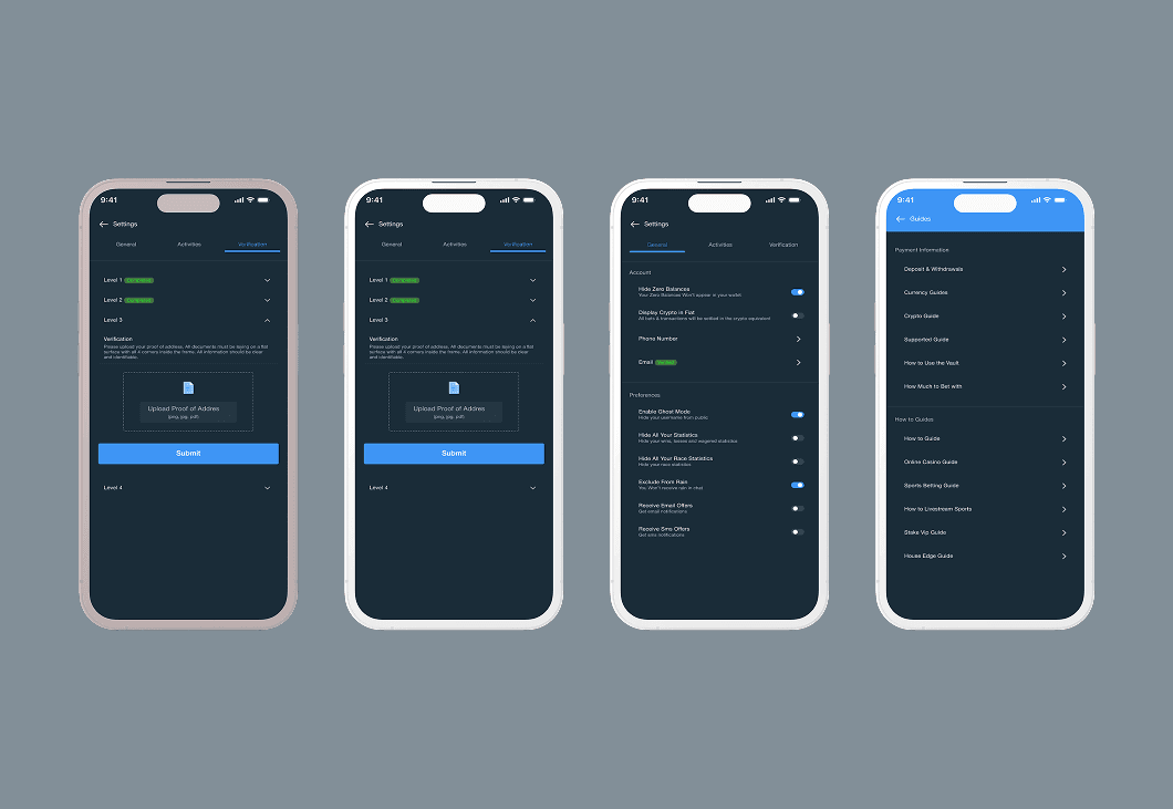
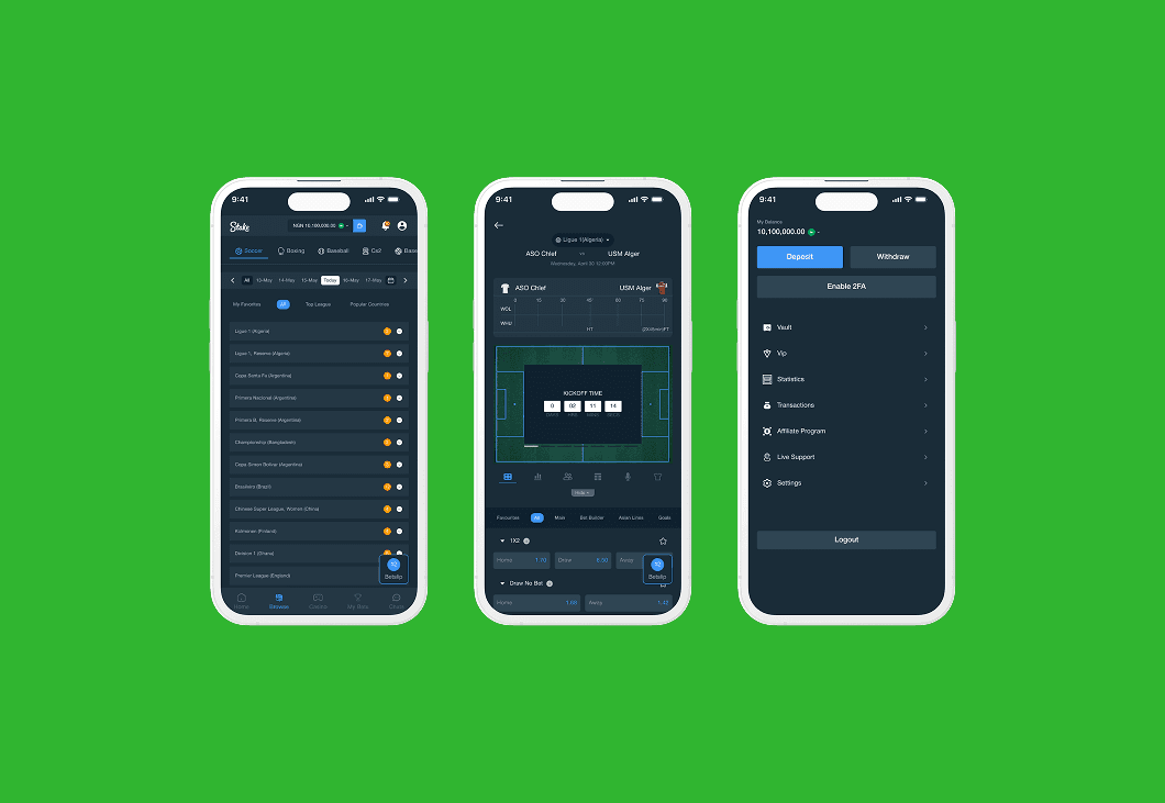
The original onboarding process on Stake.com was not beginner-friendly, especially for users new to crypto or online gambling. Key actions like placing bets or finding games lacked clarity and visual hierarchy, making the experience overwhelming. The interface was visually cluttered, particularly in content-heavy areas like live sports and casino lobbies. There was also a noticeable lack of feedback and microinteractions, which made actions feel unresponsive. Additionally, users had to toggle between wallets and games without a smooth or intuitive transition.
The redesigned experience addressed these issues by introducing a more guided onboarding flow to reduce drop-offs during registration. Navigation and game discovery were simplified, helping users access key content more easily. Wallet visibility and real-time feedback were improved to boost user confidence during transactions. The interface was cleaned up with bolder visuals that reinforced Stake’s brand while enhancing overall usability.
Although this was a conceptual case study, the redesign highlights how thoughtful UX and UI improvements can lead to higher engagement especially during onboarding and betting moments—while reducing friction for users navigating crypto payments. The result is a more immersive, confident gambling experience that doesn’t compromise on speed or functionality.

Deliverables

I conducted a UX audit of the existing Stake.com web app to identify friction points and usability issues. This helped uncover gaps in the user experience, particularly for different user segments. I developed user personas and journey maps to capture the distinct needs of first-time users and VIP crypto gamblers, ensuring the redesign addressed both groups effectively.
Based on these insights, I created low to high-fidelity wireframes focused on key areas such as onboarding, casino browsing, and live betting. The UI redesign introduced improvements in layout, typography, and navigation for a more intuitive experience. I also built an interactive Figma prototype to showcase smoother user flows and engagement strategies. Additionally, I enhanced interaction design by adding clear feedback cues and contextual CTAs to guide users and increase overall usability.

Result

The redesigned experience introduced a more guided onboarding process aimed at reducing user drop-off during registration. Navigation and game discovery were simplified to make key content easier to find, while wallet visibility and real-time feedback were enhanced to build user confidence. The interface was also redesigned to be cleaner and bolder, reinforcing Stake’s brand while improving overall usability.
Though conceptual, this case study demonstrates how thoughtful UX and UI improvements can significantly boost user engagement—especially during onboarding and betting. It also shows how reducing friction for new users navigating crypto payments can lead to a more immersive and confident gambling experience without sacrificing speed or functionality.

Create a free website with Framer, the website builder loved by startups, designers and agencies.