Project Overview
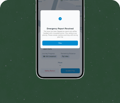
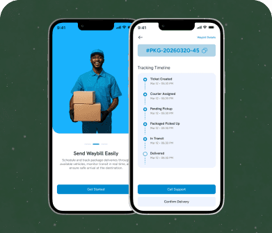
Along is a ride booking application designed to connect riders with drivers in a fast, reliable way, while also giving the platform's internal team the tools needed to oversee operations across the network. I designed the complete experience across three distinct interfaces: the rider app, the driver app, and the admin dashboard, delivering each of them in both light and dark mode so that the entire ecosystem felt cohesive and equally polished regardless of who was using it or when.
Project Goals
The goals for Along were to design three distinct, purpose-built experiences for riders, drivers, and administrators while keeping them visually and functionally unified as one platform; to prioritize transparency and calm for riders, safety and glanceability for drivers, and oversight and control for administrators; and to deliver a fully realized light and dark mode across all three apps so the entire ecosystem felt equally polished regardless of context or time of use.
Project Challenges
The central challenge with Along was designing three genuinely different experiences, each serving a different user with different needs and different contexts of use, while keeping them visually and functionally unified as one coherent platform.
Riders needed a fast, reassuring booking experience with clear pricing, driver information, and live tracking; drivers needed a low-distraction, glanceable interface they could safely interact with while actively driving and picking up passengers; and administrators needed a dense, data-rich dashboard for monitoring rides, drivers, and platform health in real time.
Designing all three consistently, and doing so across both light and dark themes, meant building a shared underlying design system flexible enough to serve very different interaction contexts without fragmenting into three unrelated products.
My Approach
I began by clearly defining the distinct goals and constraints of each user type: speed and reassurance for riders, safety and glanceability for drivers, and oversight and control for administrators, and let those goals shape the specific interaction patterns for each app while keeping a shared visual language across all three. For the rider app, I focused on a clean booking flow with transparent pricing and live map tracking that made waiting for a ride feel low-stress.
For the driver app, I prioritized large touch targets, minimal necessary interaction, and high-contrast, easily glanceable trip information, since drivers needed to absorb information in short glances rather than sustained attention.
For the admin dashboard, I built a dense but well-organized layout surfacing live ride activity, driver status, and platform metrics, using consistent card and table patterns so administrators could monitor the network efficiently. Building all three interfaces in both light and dark mode meant carrying a single robust color and component system across drastically different use cases, from a rider casually browsing at home to a driver navigating in bright daylight or at night.
What I Delivered
I delivered complete designs for the rider app, driver app, and admin dashboard, each fully built out in both light and dark mode. This included rider onboarding, ride booking and fare estimation, live driver tracking, trip history and receipts, and payment management for the rider app; trip requests, navigation handoff, earnings tracking, and driver status and availability controls for the driver app; and live ride monitoring, driver and rider account management, dispute handling, and platform analytics for the admin dashboard, all unified under one consistent design system.
The Outcome
The completed multi-app system gave Along a genuinely professional, cohesive platform spanning its entire operational ecosystem rather than three disconnected tools bolted together. Riders benefited from a booking experience that stakeholders described as noticeably calmer and more transparent than competing apps, drivers reported that the low-distraction interface felt safer and easier to use while actively working, and the operations team found that the new admin dashboard made it dramatically easier to spot and respond to issues across the network in real time. The consistent light and dark theming across all three apps also meant the platform felt equally considered no matter which part of the ecosystem a person was interacting with, reinforcing trust in the brand as a whole.