Project Overview
NattyPay is a Nigerian fintech application built to give everyday users a fast, trustworthy way to send and receive money, much like the standard digital banking apps that millions of Nigerians now depend on for their day-to-day financial lives.
The product spans both mobile and web, and was conceived to compete in a crowded market where users have very little patience for friction, confusing flows, or interfaces that feel unsafe. As the designer on this project, I was responsible for shaping the visual language and user experience across both platforms, and for building out a fully considered light mode and dark mode so that the product would feel equally polished no matter how or when a user chose to access it. Given how central trust and clarity are to any financial product, every design decision on NattyPay was made with the understanding that a single confusing screen or an unclear confirmation state could cost the business a user forever.
Project Goals
The primary goals of the NattyPay project were to build user trust through clear, unambiguous financial communication at every step; to create a single, unified design system capable of powering both mobile and web without duplicated effort; to offer a genuinely well-crafted dark mode rather than a token alternative theme; to reduce onboarding drop-off by simplifying KYC and account setup; and to give the brand a distinct, modern visual identity that would help it stand out in Nigeria's increasingly competitive digital banking landscape.
Project Challenges
The core challenge on NattyPay was designing a financial experience that felt instantly trustworthy to a Nigerian audience that has, in many cases, been burned before by unreliable apps, failed transactions, and confusing error states from other platforms. Money transfer is an inherently anxiety-inducing action for most users; they need to feel, at every step, that their money is safe, that the transaction is going through correctly, and that they can always see what is happening with their funds.
On top of that emotional challenge was a technical and design one: building an interface system robust enough to support both a light and a dark theme without either one feeling like an afterthought, while also making sure the mobile and web experiences felt like they belonged to the same brand family even though they serve different contexts and screen real estate. There was also the challenge of designing for a wide range of Nigerian users, from highly tech-savvy young professionals to less experienced users who needed simpler, more guided flows, all while keeping the interface fast and lightweight enough to work well on lower-end Android devices, which still make up a significant share of the market.
My Approach
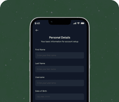
I approached NattyPay by first mapping out every core money-movement journey a user would take, from onboarding and KYC verification, to funding a wallet, sending money to another NattyPay user, transferring to a bank account, and checking transaction history and receipts. Rather than designing screens in isolation, I built a full design system first, defining typography, spacing, color tokens, and component states so that both the light and dark themes could be generated from the same underlying structure and stay perfectly consistent as the product scaled.
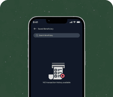
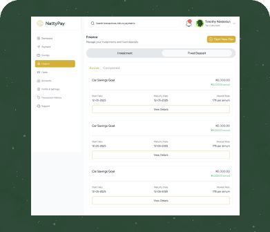
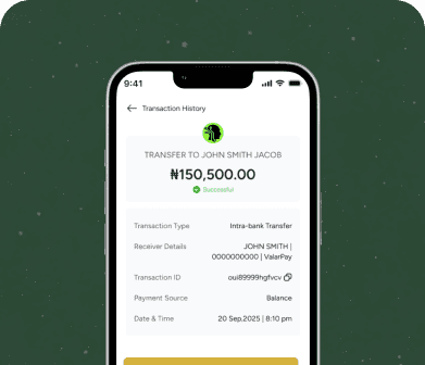
I paid particular attention to color psychology and contrast, since financial apps live or die by how clearly they communicate success, pending, and failure states, and I made sure every one of those states was unmistakably clear in both themes. For the web app, I adapted the same component library into a layout that took advantage of larger screens for things like transaction dashboards and account overviews, while keeping the core actions, sending and receiving money, just as fast and thumb-friendly in spirit as the mobile experience. Throughout the process I ran the flows past real user mental models of Nigerian banking apps, borrowing familiar patterns where they reduced cognitive load, while introducing more modern visual polish where it added confidence rather than confusion.
What I Delivered
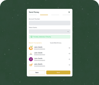
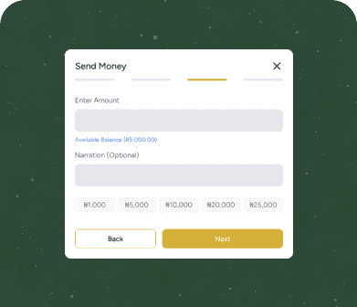
I delivered a complete, production-ready design system for NattyPay covering both mobile and web applications, fully built out in both light and dark mode. This included the entire onboarding and account verification flow, wallet funding and withdrawal flows, peer-to-peer and bank transfer flows, transaction history and detailed receipt views, savings and account management screens, notification and alert states, and a full settings and security section covering PIN management, biometric login, and device management.
I also delivered a component library with every button, input field, card, modal, and status indicator documented in both themes, along with a set of empty states, error states, and loading states designed to keep the experience feeling alive and communicative even when things go wrong or take time to load. On the web side, I delivered responsive dashboard layouts that gave users a broader view of their financial activity while preserving the same visual identity established on mobile, ensuring a seamless experience for users who move between devices throughout their day
The Outcome
The outcome of the NattyPay design work was a cohesive, dual-platform financial product that finally gave the brand a visual identity strong enough to stand shoulder to shoulder with more established players in the Nigerian fintech space. Internal stakeholders reported that the dark mode in particular became a standout differentiator, with a noticeably higher proportion of users opting into it than the team had originally projected, a strong signal that the theme had been designed with genuine care rather than as a simple color inversion.
The consistency between mobile and web also meant that support tickets related to user confusion around transaction status dropped significantly after launch, since the redesigned success, pending, and failure states communicated so clearly. More broadly, the project gave the NattyPay team a scalable design foundation that let engineering ship new features faster, because every new screen could be assembled from an already-proven system rather than being designed and second-guessed from scratch each time.