Project Overview
ValarPay is a Nigerian fintech platform designed around helping users save, grow, and manage their money with the same everyday ease as sending a bank transfer. While it shares the same broad category as other digital banking products, ValarPay's identity is built more around long-term financial wellbeing than pure transactional speed, positioning itself as the app a user opens not just to move money, but to plan for where that money is going.
My role was to design a coherent visual and interaction system for ValarPay across its core experiences, delivering both a light mode and a dark mode so that the product felt considered and complete regardless of a user's viewing preference or time of day.
Project Goals
ValarPay's design goals centered on making long-term saving feel emotionally rewarding rather than abstract; building a clear visual separation between spendable and growing money to reduce user anxiety; delivering data visualizations that communicate financial progress instantly; ensuring both light and dark themes preserved the same sense of calm trustworthiness; and creating a scalable system that could support new savings and investment products without requiring a ground-up redesign each time.
Project Challenges
The central design challenge with ValarPay was communicating financial growth and progress in a way that felt motivating rather than clinical. Savings and investment products often struggle because their core value, money quietly growing over time, is inherently undramatic and hard to visualize in a compelling way.
I needed to design dashboards, charts, and goal-tracking interfaces that made incremental progress feel rewarding and easy to understand at a glance, without resorting to gamified gimmicks that would undermine the seriousness users expect from anything touching their finances. There was also the challenge of designing two full themes that both needed to carry that same sense of calm confidence, since a savings app's dark mode has to feel reassuring at night rather than ominous, while the light mode needed to feel bright and optimistic without appearing juvenile.
My Approach
My approach started with competitive and behavioral research into how users think about saving versus spending, which shaped an information architecture that clearly separated 'available to spend' balances from 'growing' balances, reducing the anxiety users often feel about accidentally touching locked savings.
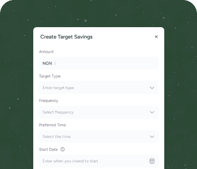
I designed a flexible goal-based savings interface, allowing users to visually track named targets, alongside simpler, more traditional fixed and flexible savings plans for users who preferred a less structured approach. Data visualization was a major focus throughout; I iterated extensively on chart types, color-coding, and micro-interactions so that a user could understand their financial trajectory within a couple of seconds of opening the app. For the dual theming work, I built the color system around a calm, confidence-inspiring primary palette that could shift cleanly between light and dark backgrounds while preserving the emotional tone of security and reliability in both.
What I Delivered
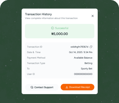
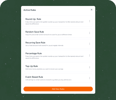
I delivered a full suite of screens for ValarPay in both light and dark mode, including onboarding and goal-setting flows, a home dashboard summarizing total balance, active savings plans, and growth over time, individual goal detail pages with progress visualizations, deposit and withdrawal flows for different savings plan types, an investment overview section, transaction and interest history, and account security and settings screens. I also produced a complete component library covering charts, progress rings, plan cards, and status badges, all documented for both themes, giving the engineering team a clear, consistent reference for implementation across the entire product.
The Outcome
Following the rollout of the ValarPay saw a marked increase in the number of users creating named savings goals rather than using only generic wallets, suggesting that the clearer, more motivating visual framing genuinely changed user behavior rather than just refreshing the surface look of the app. The dark mode was well received by users who reported using the app late at night to check on their savings progress before bed, and stakeholders noted that the calmer visual tone helped position ValarPay as a more serious, trustworthy alternative in a market often associated with flashy, short-term thinking. The unified design system also meant future savings products could be added to the platform quickly, since new plan types could be slotted into the existing component library without a redesign.